Sometimes things get boring in the bedroom. Stale. Just the same old thing, day after day, week after week, month after month. A sense of ennui sets in and all you can think about is how something has to change. You just can’t continue the way things are.
No, I don’t mean that has gotten boring! I mean your decor has. Geez, you people always have your minds in the gutter!
Well, when things have gotten dull, spice it up! Consider it a marriage encounter for your decor!
Recently I was feeling bored (with my decor) and so I decided to spruce things up a bit. As always, I’m on a tight budget, so it included a combination of rearranging some of what I already have, using some things that have been curing for years, and adding a little bit of new to the mix.
In general, I’m moving from a more traditional look to a more eclectic look – vintage and shabby chic marry mod. OK, so that’s more of a threesome than a traditional marriage, but when we’re decorating we don’t always need to follow societal norms!
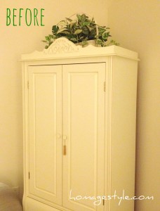
Let’s start with the armoire. Here’s the before pic, with fake plants that look just fine, but no doubt more in the traditional vein…
 Goodbye fake plants, hello gold dress form trussed in faerie lights!
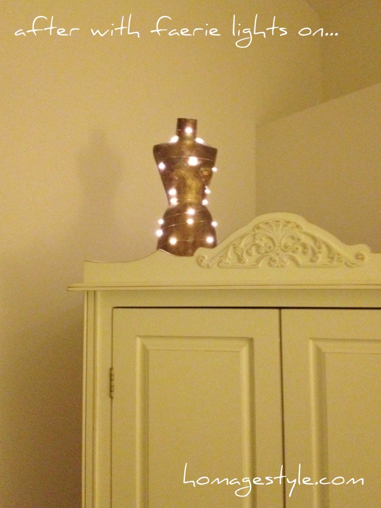 The faerie lights were $11.99 plus shipping. Well worth the expense. They’re battery operated, so there are no pesky wires running over the side of the armoire. Plus they run on a timer, so I can turn them on and six hours later they go off automatically. Perfect for when you need to spice things up with some ambiance!
Here’s how it looks during the day with the lights off…
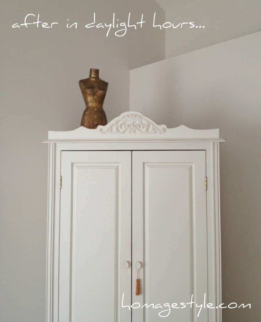 You will notice that the dress form is off center, and there’s a lot of empty, open space on the top of the armoire. I’m really trying to get OK with imperfection. That includes getting comfortable with negative space and off-center presentation. I’ve actually grown to love the oddness of it all…it really highlights the dress form as the featured element.
Speaking of the dress form, this beauty has been curing for years! I purchased her for $1.25 at a local high school rummage sale. Been waiting to find the perfect place for her. Think I’ve found it!
Moving on…
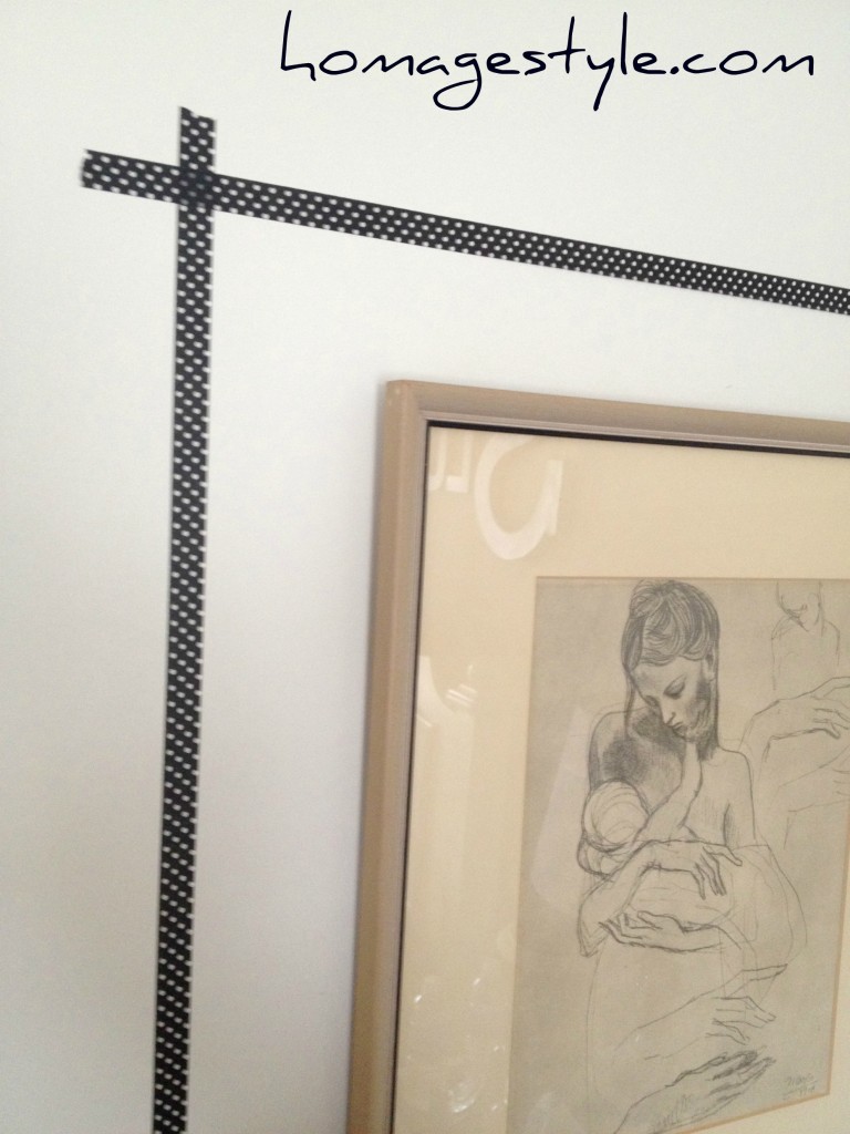
Let’s take a look at one of my favorite possessions. A Picasso print of A Mother and Child and Four Studies of Her Right Hand. This was my grandmother’s print and I always loved it in her home from the time I was a kid. I’ve had it in my bedroom since I got it, but thought it needed to be featured a little more prominently, so I added some black and white polka dotted washi tape to frame it out…
 I just eyeballed the tape placement, because that’s what I do, but you could always be more precise and measure it out like a normal human.
(If you’re wondering why I have such weird angles with the wall hangings, it’s because I get a lot of light in this room so the angle is the only way to avoid glare in the pic. Carry on…)
Another angle…
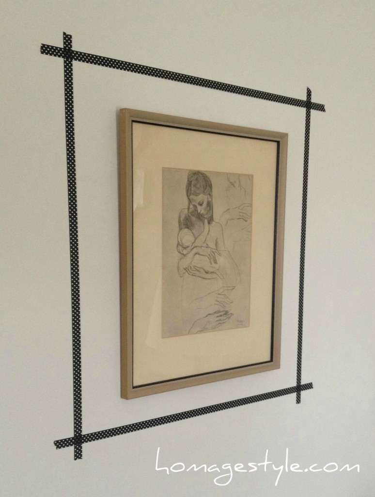 I love, love, love how this looks! It really brings out the tiny, black rim on the frame, as well as the black in the sketch. Plus the washi tape was a steal – I got 3 rolls for $2.99 at Michaels. More to come later with one of the other rolls of tape.
By the way, polka dots are my fave. Especially black and white polka dots. So this just makes me happy every single day when I see it! Here’s a close-up so you can better see the polka dots (as well as the aforementioned glare)…
 Enough about that. On to the one splurge.
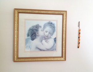
Before the splurge, there was an angel print, accompanied by a broken vintage bracelet…
 The splurge was spending $40 on a custom-printed Lumineers poster on Etsy…
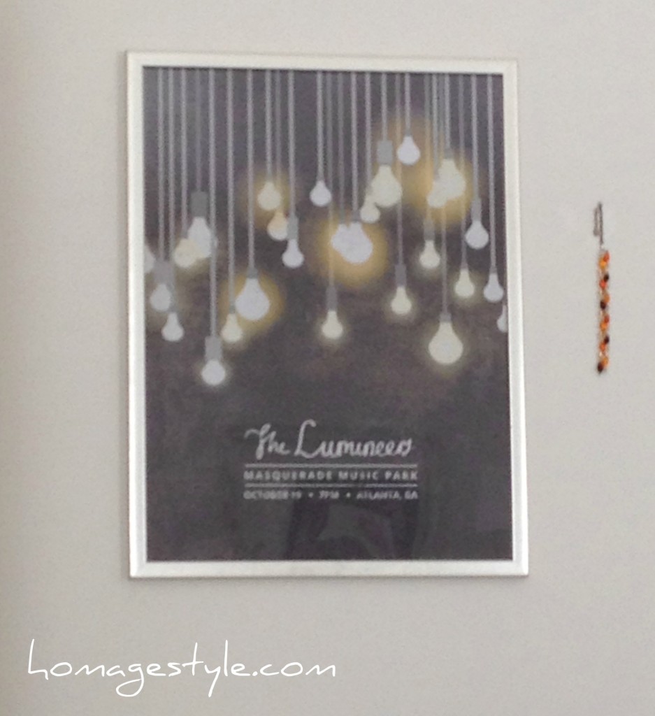 I love the Lumineers and I superlove the poster art! The perfect mod piece to start the sexy love affair with vintage and shabby chic.
Sadly, I won’t be sharing the artist info here, because it took over a month and opening a case on Etsy to finally get the seller to ship, despite having paid. But at least I finally received it and I’m in love!
I tossed it into a basic poster frame and voila! Here it is from another wacky angle…
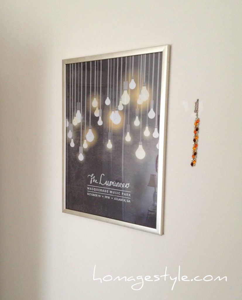 And you can see the vintage bracelet remained.
To the left of my bed I tightened up the placement of the pieces that were already hanging on that wall, to give them more of a vignette feel…
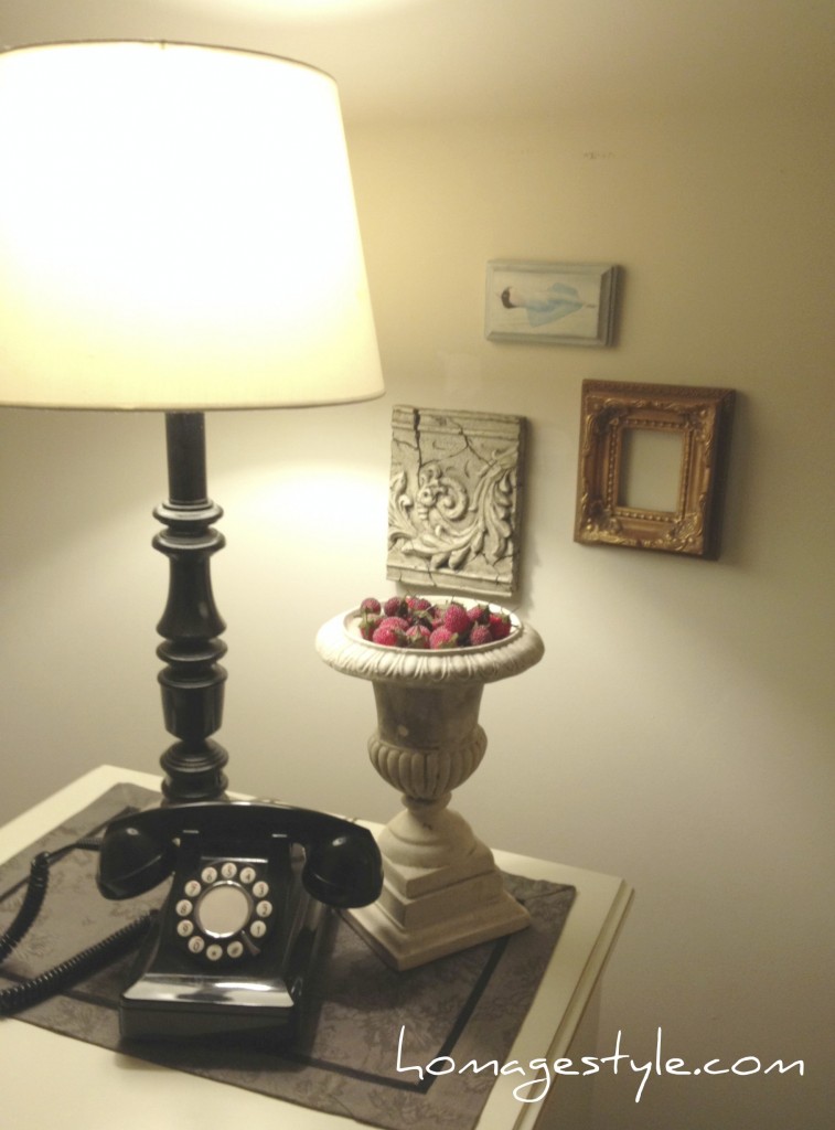 And on the right side of my bed I added a gorgeous mermaid print I bought a while back on Etsy from artist Amy Huddleston. (You know the drill…it was curing for a while.) I placed it in a mod white frame, which really brought an eclectic feel to the grouping. Talk about mod and vintage and shabby chic!
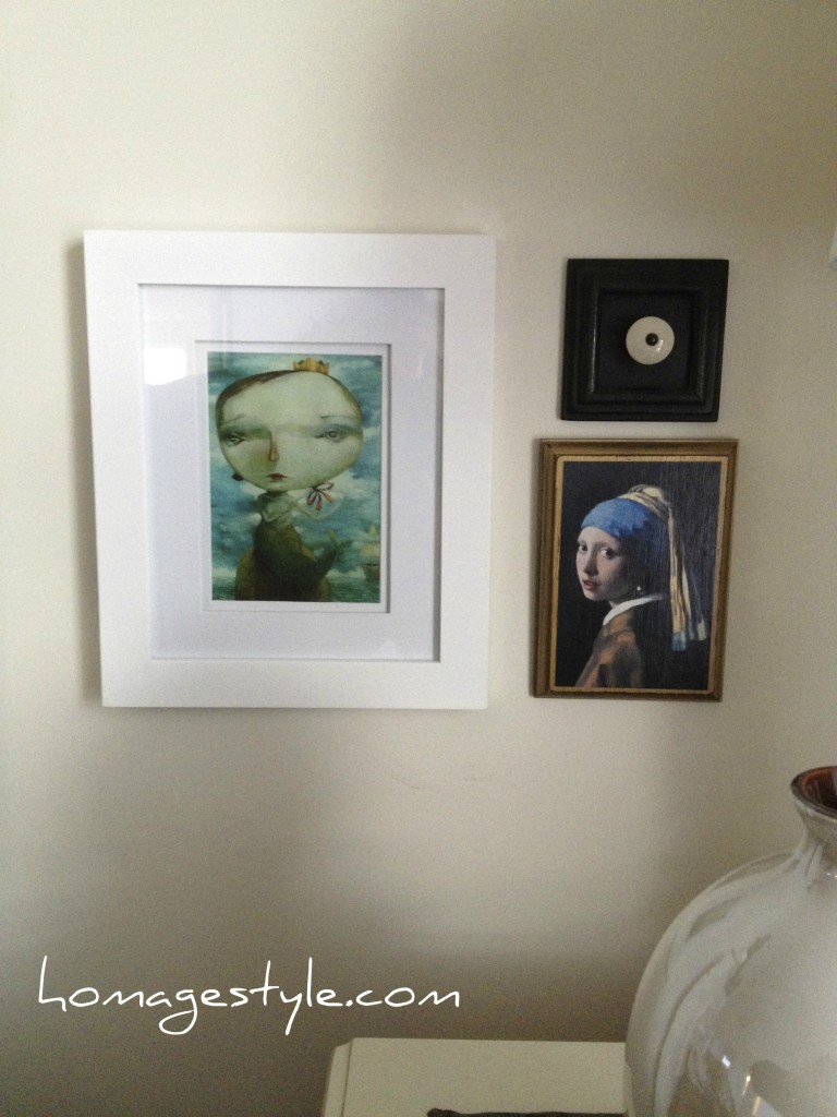
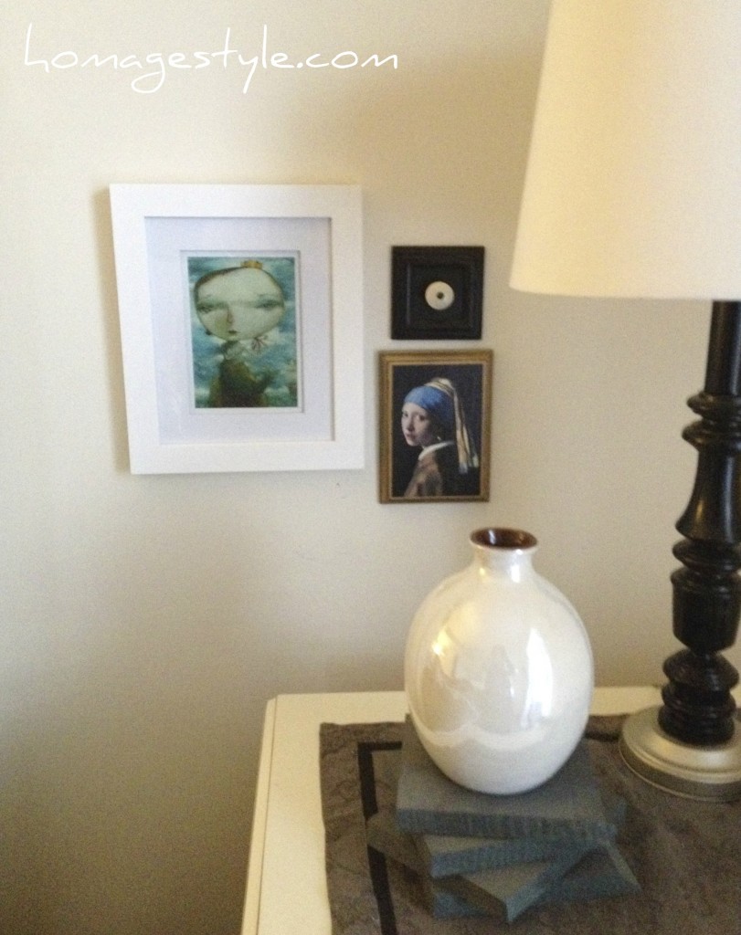 The blues and aquas and in mermaid print bring out the blue in the Girl with a Pearl Earring by Vermeer. Which, by the way, I found on the back of a Reader’s Digest magazine and decoupaged to a piece of painted wood.
But the white frame seemed too stark. Something was still missing…know what I mean?
 Oh yeah. Washi tape, part deux.
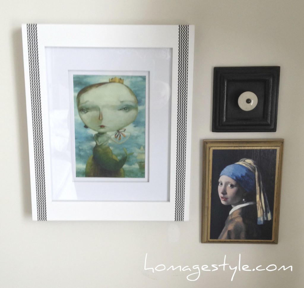 I added some black and white chevron washi tape – part of my $2.99 three-pack – and it did the trick! Toned down the starkness of the white and tied it to the black in the other two pieces. Here’s a close-up…
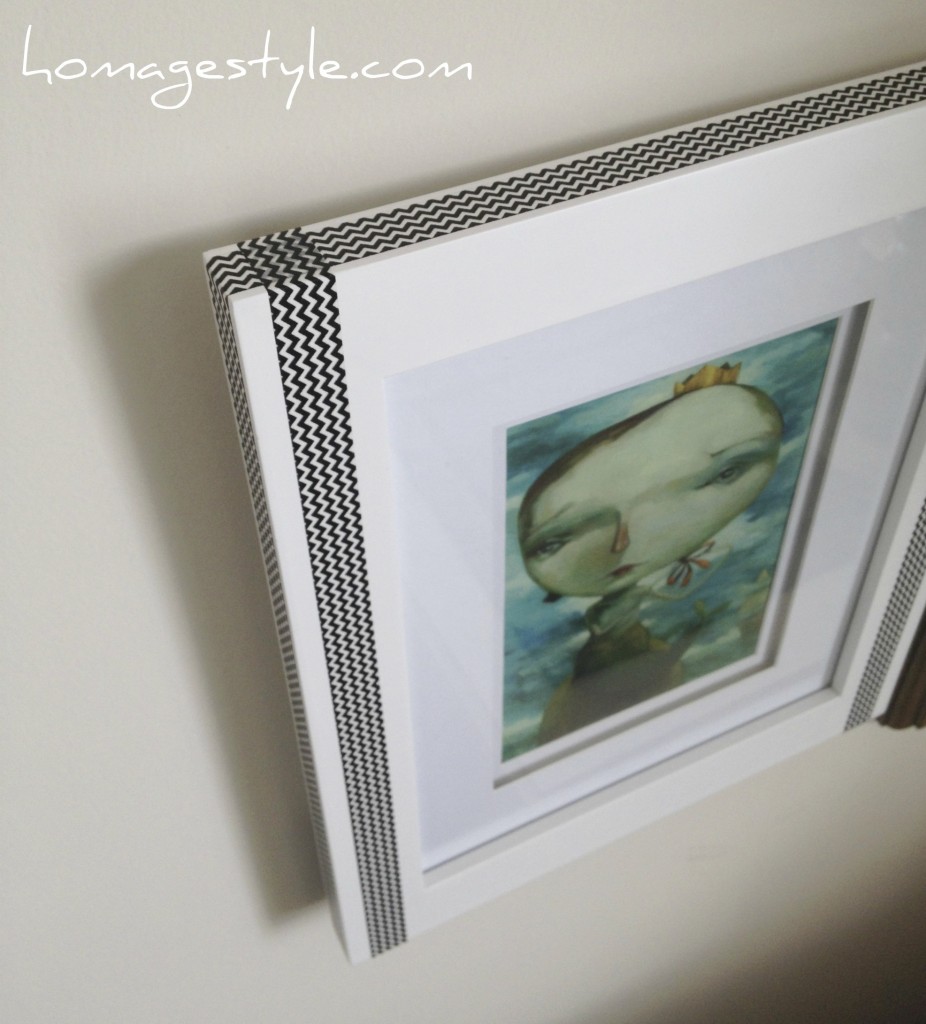 Taping perfection. Just eyeballed this as well. You could do the same, or maybe even be more precise and measure.
Although those are all awesome, we’re still not finished.
Previously, I had this angel art all lined up in a row…
 Very pristine and orderly, but where’s the flair?
I’ll tell you where the flair is…right here…
 I mixed those bad boys up for a touch of the unexpected! We can’t be angelic and perfect all the time, especially when things have gotten boring in the bedroom!
Here’s where they are in the room…
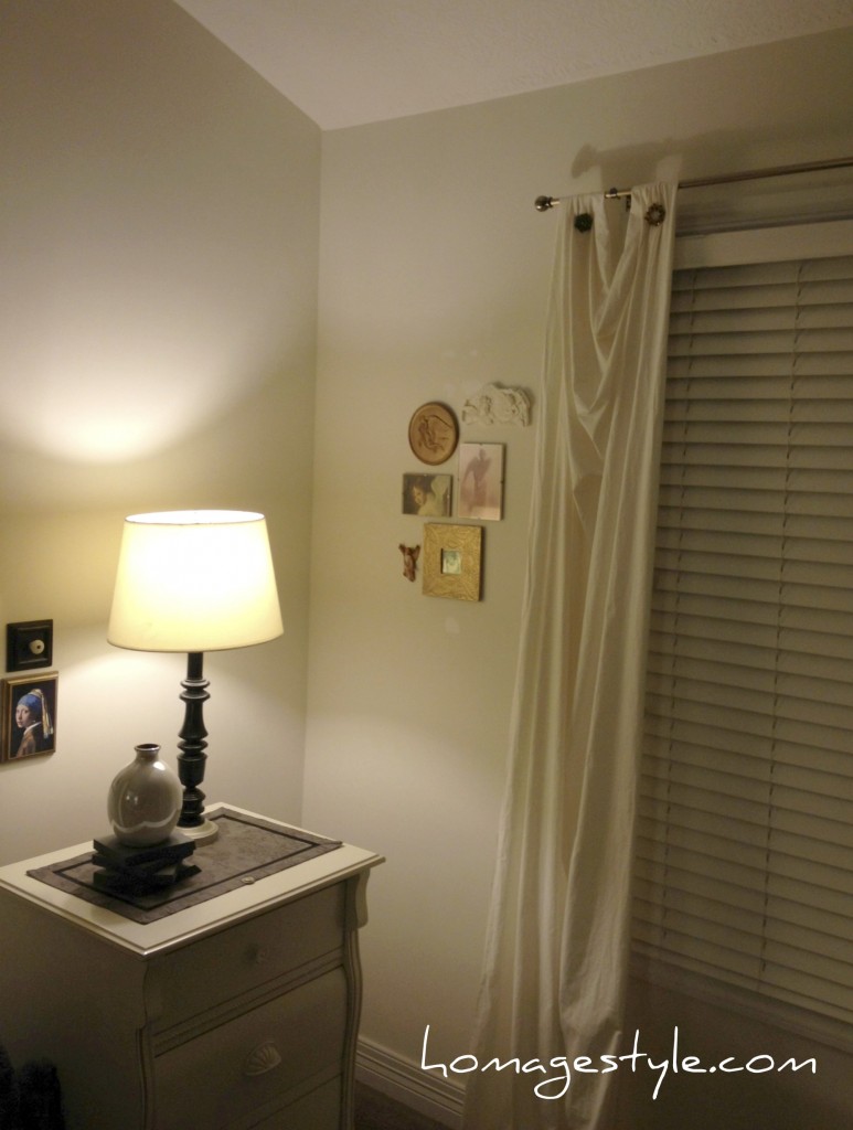 And finally, I dug deep into the world of curing and found these vintage mailbox doors that I purchased on eBay approximately 10 years ago.
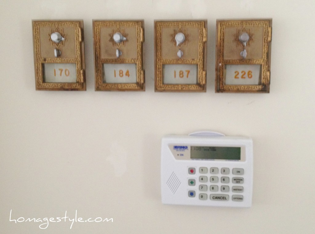 I figured that it was time to take the focus off the alarm system and the light switch – boring! – and add something interesting to this spot!
Now mind you, I did slice my finger open adding picture hanging wire to the back of these and heavily debated whether I needed a tetanus shot – I didn’t end up getting one and fortunately lockjaw has not set in – but they were certainly worth the effort!
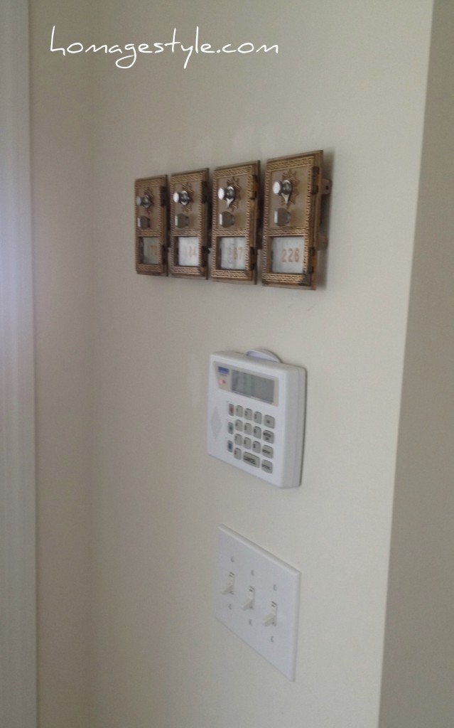 They just look so cool all lined up and are another metallic element, adding to the mixed metals in the room, accents of silver and gold and bronze.
A whole new fun, updated bedroom for less than $100. Cheaper than sexy lingerie and a night out on the town! Who’s bored now?
Take my advice…don’t be afraid to mix it up in the bedroom!


Leave a Reply